CLICK HERE FOR FREE BLOGGER TEMPLATES, LINK BUTTONS AND MORE! »

Thursday, January 10, 2013

Past Projects: Birthday Card #2

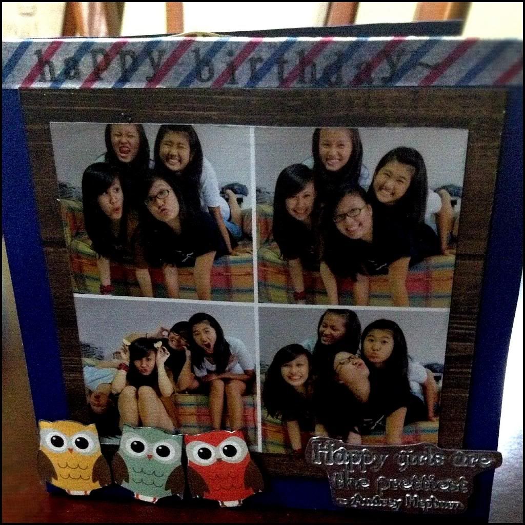
Hello all! It's been quite awhile for those...ahem...religiously following this blog (thank you very much if you're one of them!) I'll keep this post short, since I have a more exciting post that's supposed to appear after this one, provided I haven't been distracted by my student exchange planning or other things. So here's a birthday card I made for a very special friend (all my friends are special:P) and I'd say this card is special because it incorporates a photograph to the front of the page!

Past Projects: Birthday Card 2
Photobucket

Let me breakdown the card (and completely ruin the magic by overtalking):
Photos: It just so happens that this group of 4 girls have a weakness for taking multiple photo shots. And what makes these 4 shots work together is that they look candid (even though they aren't exactly candid). I find candid shots work very well in a series/set like this because it gives a sense of fluidity. It's almost as if you can sense our personality/fun-loving spirit jumping of the pages. The white border was easy to make, with a little help from photoshop(: And it breaks up the photos nicely, without standing out too much (as opposed too a black border). I then mounted it on a wood grain paper so that it will look rustic(:

Owls: I cut them out from a 12 by 12 paper from echopark. I LOVE THESE OWLS. I've been using them in quite a number of cards, including one that I previously displayed here in the first birthday card. I cut them out individually this time though, and stuck them using foam adhesive so they pop up.

"Happy Girls are the prettiest" sentiment: Basically, I've recently learnt how to use a heat tool and embossing powder after FINALLY investing in one.


Photobucket
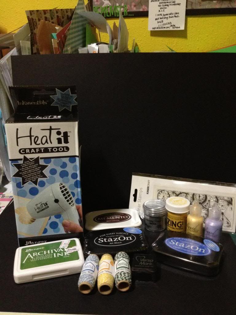
see my heat tool? it says "Heat it craft tool"! the rest of the items are a couple of things I bought after a trip to mapletreehouse at IMM.

So basically I've been trying out embossing with colour (the yellow bottle called Zing! by american crafts) and silver (the ranger silver embossing powder) and clear (Ranger Super fine detail clear embossing powder not featured here).

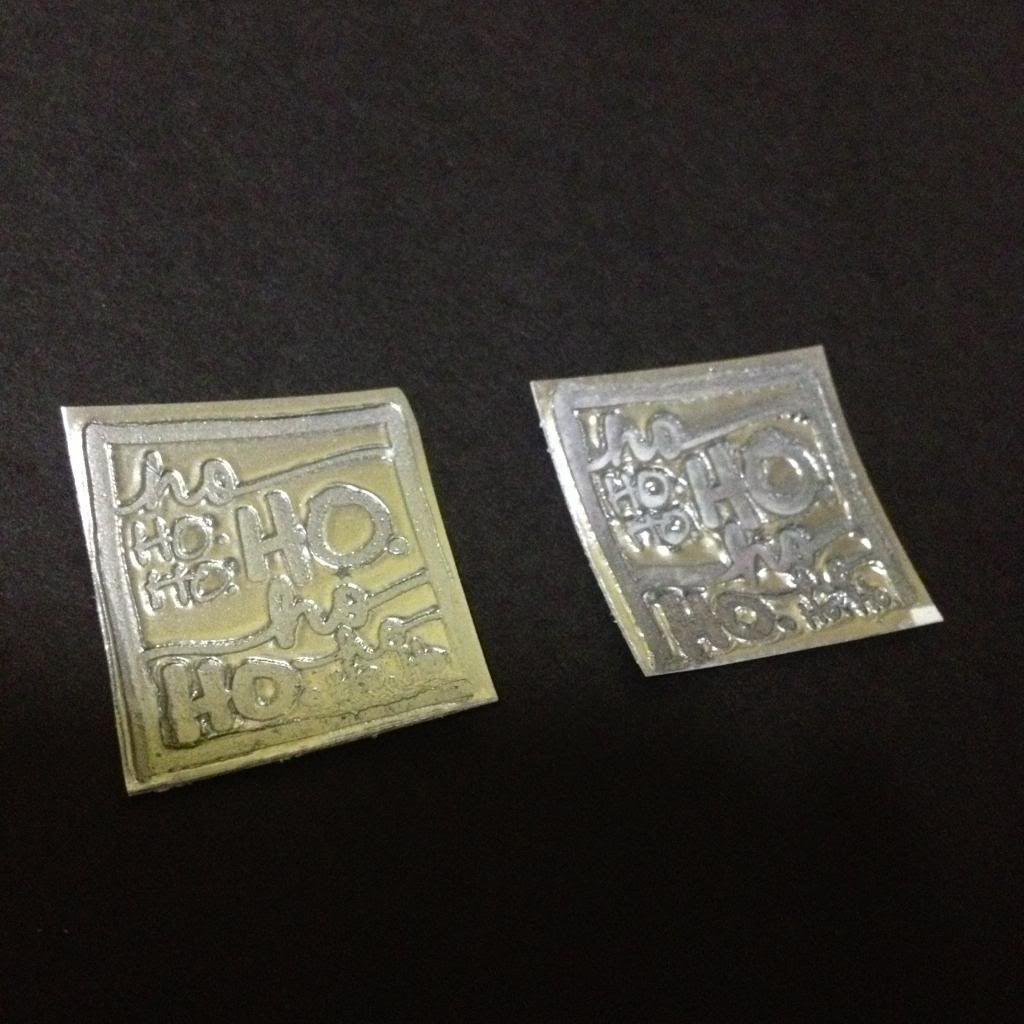
And I LOVE LOVE LOVE faux metal embossing, like how the phrase has been done. I'm kinda lazy to link up a youtube video that I watched that taught me how to do it, but basically it's layering a piece of paper with a few layers of silver embossing powder, heat setting each layer and then at the final layer while the powder is still all gooey and melty, you stamp the stamp into it, creating an indentation. It's magic, I tell you. GENIUS. 
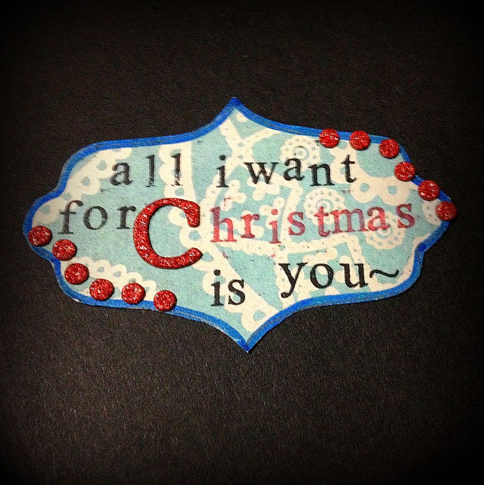
haha. So i've been playing with that a lot, and it's what I did on some of my christmas cards too.
Photobucket
I'll probably do a more throrough demonstration when I talk about the christmas cards! CAN YOU BELIEVE THESE WERE FROM PAPER?? 
Yupp, so that's all for the card today. I'll be posting a review of one shop I ALWAYS frequent, either today or tomorrow, depending on the time, so do watch out for that too!
Wednesday, January 2, 2013

Past Projects: "Hello 2013" Card

It's 2013 finally! Really cannot wait to go on my exchange. Once I'm on exchange in the UK though, this blog will probably be filled with travel scrapping pages...at least, as soon as I've cleared all the cards and other posts I've already promised to do. I can't wait for 2013, and as my sister returns to school today, I thought it would be nice to make her a card, to cheer her on! If any of you are UK readers (not quite sure if there are any), do drop a comment to let me know where are good places in the UK to get scrapbooking stuff!

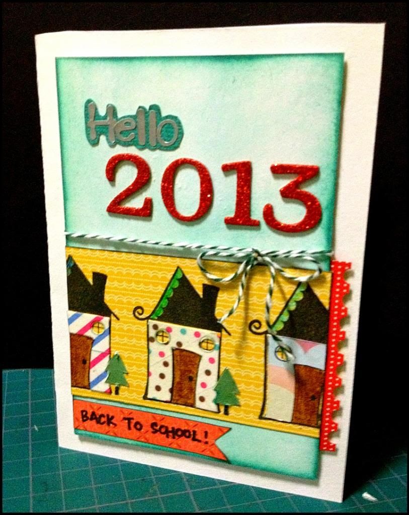
"Hello 2013" Card
Photobucket

As you may be able to see, the top edge of the card is a little uneven, and that's because of a minor mishap that occurred while trying to trim it. Initially I intended there to be a 1cm margin around the edges, but after fiddling around with the centrepiece, I realised that a 1cm margin made the border look really bare. So I scaled it down, after I mounted the middle piece on with foam adhesive. which was a BAD IDEA. note to self (and others) :do any necessary pen knife cutting BEFORE pasting anything on the card base.
Photobucket
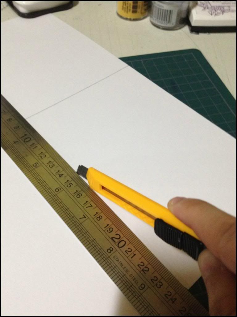
It took me a while to remember why I have this picture up. So, most professional card makers would use a scoring board to score their paper, and a cutting mat with proper lines to measure out the right size. Unfortunately for me, I'm a scrapper on a budget. So my tools are a ruler, a pencil and a penknife. It makes things more tedious, definitely. But it saves me loads of money! The cheapest scoring board I found costs about 50SGD, give or take. And my cutting mat is too small, since it cost only 2SGD from Daiso (probably will get a new one soon though!)

Anyway, the original card size was 10.5cm by 15cm. After scaling it down, it became 10cm by 14.6cm. The middle piece is 8.5cm by 12.8cm. (If anyone is remotely interested in numbers.)
Photobucket
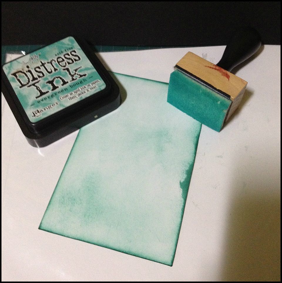
Initially I wanted the back ground piece to be patterned, But I decided not to waste paper, and I distress-inked the middle piece from the white A4 paper my card base is from. I only ever use "A'zone creative project cards 220gsm (and above)" they sell them in packs of 15, and from popular, each piece costs approx 15 cents. Which I find cheaper than buying the 12by12 plain cardstock. It's easier to keep and handle too. Anything less than 220gsm is a little too flimsy for cardmaking.
Photobucket
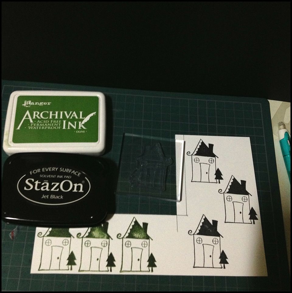
For the house part, I used this house stamp from a christmas stamp set, and stamped with the two inks shown. After stamping, I realised the house was rather difficult to cut, and so I decided to stamp the black houses straight onto the yellow patterned paper instead. The green houses were basically for me to cut out the green trees to paste them over the black ones, and to stick washi tape onto the white body of the house, cut that out and paste that over for a colourful effect.


2013 is looking to be a great year! I happened to find something interesting on instagram, from one of the many craft people I follow. They were coming with a "word for the year" (for their own year) and I thought I should come up with mine too, to use as the theme of the schedular that I'm gonna design on my own!
I'm thinking along the lines of exploration, since half of 2013 is going to be spent out of singapore. So far, I've got:
1. Risk
2. Take Chances (2 words I know, but it doesn't work with 1!)
3. Dare

But I haven't really found one that I really really like. So if you can help me out, that would be wonderful!!(: Leave a comment below if you can think of a word that kinda fits into what I'm thinking of! If your word is chosen by me in the end, you have my endless thanks and appreciation, and maybe even a reward!(: So do try and help me, I'm a little stuck(: Thanks!

Saturday, December 29, 2012

Past Projects: Birthday Card #1

One of the things I make on a regular basis are birthday cards, unless there's any major event coming up like Christmas or Valentine's day. That's because the joy of completing a beautiful project, and the pride in seeing someone else's eyes light up makes the effort (and cost!) worthwhile. Just a month or so ago, I was at popular queuing in line to purchase some craft essentials (like double sided tape) and this lady who was in front of me handed the cashier this really plain white card from Memory Lane...on a second thought, it might have been hallmark, I'm not very sure. But the point is, there was a single design element (a simple, small picture) on a plain white card with no words inside and it cost her $13! I was truly shocked..and even more so that she found it normal to pay $13 for a single card that was unremarkably...unspecial. But I guess not everyone has the time to make their own cards...it's not exactly a cheap hobby either. But when you divide overall cost by the numerous cards..and by the heart put into it...I'd say it's worth it(:

So, I'll share a few cards I've made, some of the ideas I got them from other card-making websites based in the US, such as Kristina Werner's blog or Jennifer Mcguire's blog which are extremely inspirational.
Here's birthday card #1 and I hope you'll find something you like here eventually!(:
Birthday Card #1

Photobucket
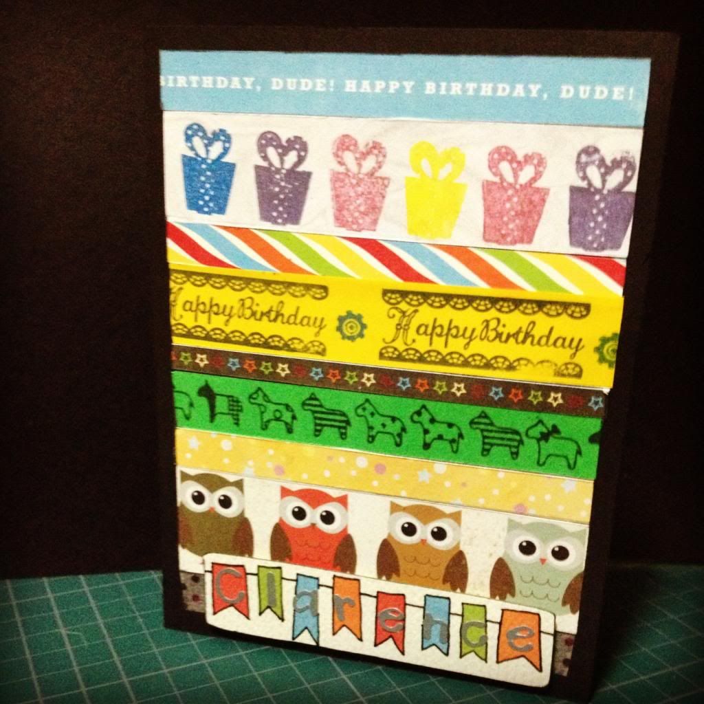
This birthday card was made for a good guy friend of mine, and made with 8 strips of paper with different designs (and 1 washi tape; but more on that later). The strips are all of the same length, but with differing widths to create more interest (rather than being too neat and perfect). Some of the strips were cut from designed paper (those kind you can buy at papermarket or one and only gallery) such as the 1st, 3rd, 5th, 7th and 8th strip. While the rest were made by stamping the various stamps I have.
The funniest part about making this card, was the numerous amount of calculations I did. I thought I had left maths far far far behind. But in trying to make the strips fit within that perfect rectangle, I had to specifically measure the width of each individual strip and calculate ( I couldn't find the rough paper anymore, I'll be sure to take pictures of every step in the future!) 

And further evidence as to my horrible math skills, I miscalculated and there was a larger than necessary gap at the bottom. To cover this up, I used some polka dotted washi tape, which was a bit transparent. But with the name element over it, you can't really see the transparentness of the tape!

Finally for the name element, I cut this out from some patterned paper, outlined the small banners, pasted some silver letter stickers, then mounted it on the card with foam tape. 

It was not an extremely difficult card to make, although the challenge lies mainly in trying to find 8 different strips of paper that could somehow match well with each other.

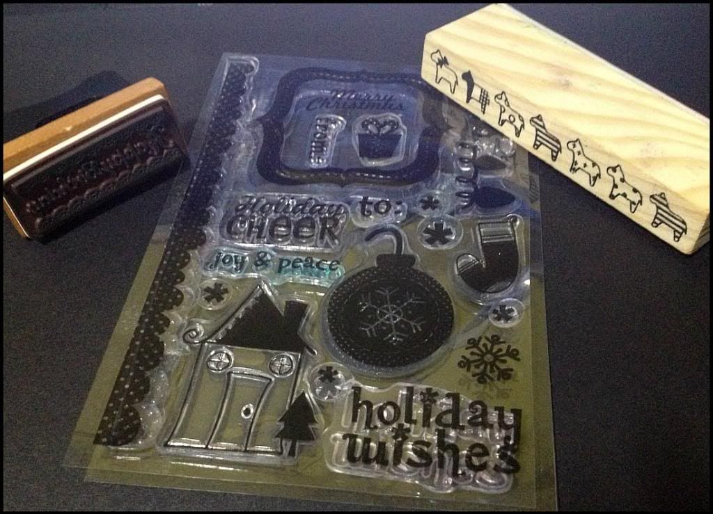
And finally, here are the stamps that I used for the stamped portions of the card:
Photobucket
The two wooden stamps were at 4 for $10 (approx $2.50 per stamp) from one and only gallery [which I will post a reccommendation/review of really soon!] and from the middle set (which is an echo park christmas stamp), I used the "present" stamp and bought the set at $3.50 from one and only gallery as well.

That's all for today, and since the year is coming to and end, my next post will probably be in 2013!!(: Happy New Year everyone!

Monday, December 24, 2012

Past Projects: Animal Card #2

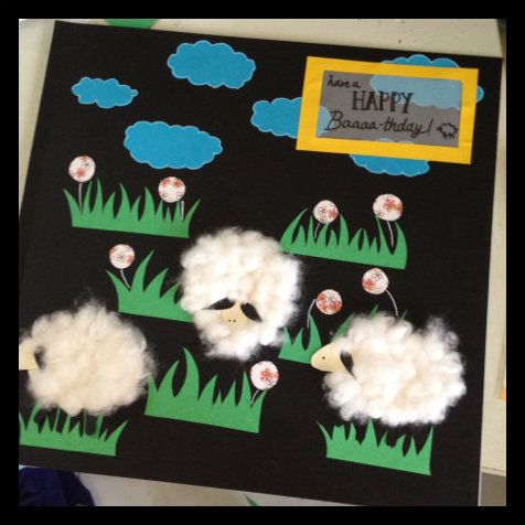
Since it's Christmas eve, first let me wish everyone who's reading this a very very MERRY CHRISTMAS! I know I should be posting about christmas cards that I've made this year, but since I haven't sent out all of them, I decided not to(: Also, this year's christmas cards can easily be tweaked to use for any other holiday season! Although personally, I wouldn't do that since that same pattern adorned the last 20 or so cards that I did and I need to do something different. So, this year's christmas card design and writeup will probably be some time later(: Instead, I decided to finish off the second animal card I did, so here is my "Happy Baaaaa-thday" card for another special friend of mine!

IMG_3067_zps53c6d42c
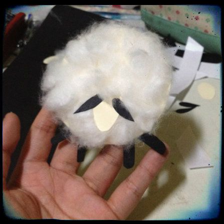
For me, the greatest lesson in the making of this card would have to be the making of the sheep. Cotton wool really gives a very nice fluffy and squishy texture, but it is definitely one of the harder materials to handle. 

IMG_3045_zpsf1912b6b
The challenge-inducing sheep

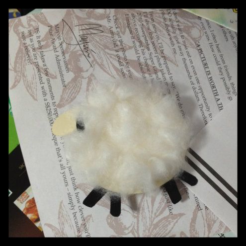
This one was slightly tougher, because I didn't base it off any picture from the internet, partly because I didn't really like the sheep images that google kept churning out for me. So, I started off with a beige coloured oval as the base. You'd want to keep the base slightly smaller than the actual size of what you want your sheep to be, because cotton wool, (for lack of a better word) tends to poof out in all directions. Initially I did the sheep with a circle base. But I realised an oval looks much more life-like.
IMG_3046_zps1732f71c
this is the circle-base sheep. of course if you prefer this one, go ahead(:
Then comes the tricky part: deciding which adhesives to use. For the first batch of sheeps (I made three batches altogether) I tried to use white glue, because I thought that would hold it better. I ended up throwing that batch away because white glue tends to be very messy. And cotton wool by itself is a very messy material too. So two messy materials placed together creates an even bigger mess, because when glue dries, it solidifies...along with the cotton wool that's encased in it, causing it to lose it's puffiness. You'll end up with a drenched sheep. The second batch I made I used double sided tape, taping the entire circle before rolling the cotton wool into little balls. The problem with doing this is that double sided tape is only one layer, therefore, the moment a little bit of the fuzz from the cotton wool balls got onto it, the tape loses it's stickiness. 

Lesson learnt: Don't work with cotton wool.
okay, I kid. But cotton wool is definitely going to be very time consuming, very messy. If you still want to do it (because it does give a great effect), try using double sided tape. It works much better than glue, but put it on a little bit at a time. Also, before placing the cotton wool balls down, roll them tightly, even if they don't look that fluffy, it's okay. That's because you can always readjust the amount of poofiness of each cotton wool ball after you've stuck it down. 

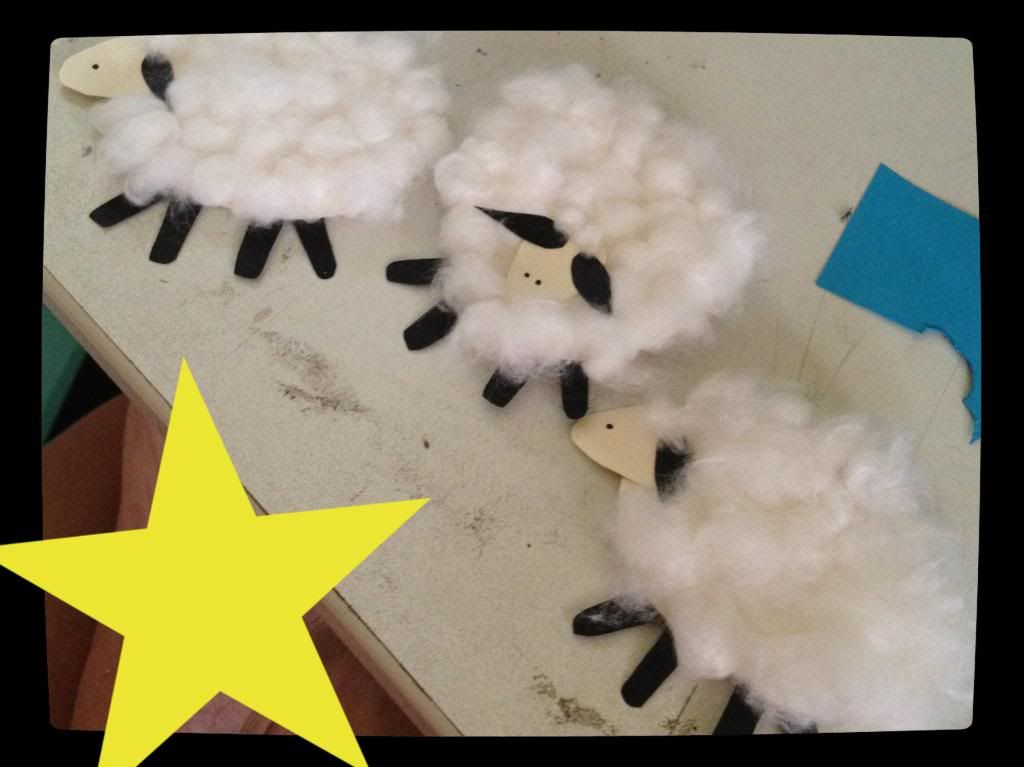
Next, affixing the head on. whether you want the sheep to face left, right or front, one lesson I learnt is to leave a space for the head on the animal's body. In other words, if the sheep is facing front, I have a sheep head-shaped 'hole' on the body where there wasn't cotton wool stuck on it. That makes sticking the head on a lot easier for you. The head, ears and legs were basically free-hand drawn by me, but they should be quite easy to do. The head is egg shaped, the ears look like elongated tear drops, and the legs are rounded rectangles. 

IMG_3062_zps628e435e
three sheep in a row. And the star is there to hide my foot which somehow wormed it's way into the photo
After that, I cut out clouds from blue construction paper and grass from green construction paper. I also found some flower designed scrapbook paper and decided to cut out circles to make the colour balance look slightly more feminine. The "Have a Happy Baaaa-thday" tagline was written on vellum, which is a great way to write words without covering up your design. 

So that's all for the animal cards! Next up in the past project series will be some more birthday cards that you can easily make for your friends. I'm hoping to showcase cards for both sexes, because masculine looking cards are just so difficult to make!(:

Till next time, and to all my readers, Have a VERY MERRY CHRISTMAS!!

Photobucket

Monday, December 17, 2012

Tools of the trade (TOTT): Distressed Inking 1

In the last post I said that I would do a post on a second animal card. However, I really wasn't intending to post that up until much later this week since I'm in the middle of Christmas card making. Unfortunately, in the middle of that, my glue tape ran out:( and I was low on double sided tape too. So I stopped what I was doing, looked at my distressed ink set (that happened to be out because I'm using it for a small part of my cards) and decided to go on record with all the mistakes I've made while trying it out, marking my very first "Tools of the Trade" post. Sounds lofty right? But trust me, I've made more mistakes trying out these tools than actually succeeding. My hope is that you won't have to make the same mistakes, since I've already made them for you! Also, I can divulge that some of the tools I'll be talking about in subsequent posts fall under the "damn, I shouldn't have bought this" category. So, don't fall into the same trap as me!

Distressed Inking #1
Photobucket
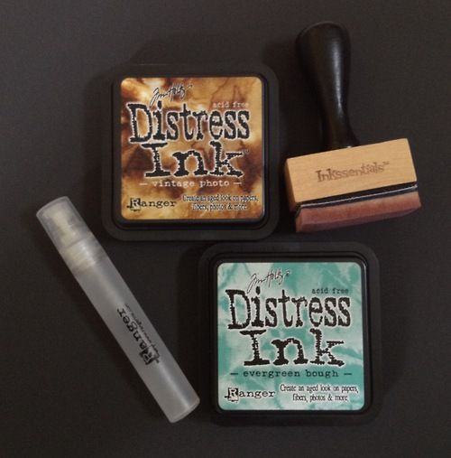
I've always wanted to try distressed inking, because I like the idea of making gradients on paper and the effect really looks quite cool. They're usually quite expensive though, so when I chanced upon maple treehouse (this really really awesome website for scrapbook tools at really reasonable prices) I decided to get all the tools I need. So, as you can see in the above picture, I got the Ranger Distressed Ink in evergreen bough and vintage photo colours ($6), the Ranger Inkssentials blending tool ($5.50), as well as the Ranger Mini Mister ($1.80) (which I won't be talking about today because I haven't quite mastered that tool yet!). There is a HUGE range of distressed ink colours (I was really surprised), but I would recommend starting with the vintage photo colour because brown really is the easiest to use if you want to create an aged effect.

So, how I "learnt" to use my tools was to watch this Tim Holtz video (starting from 4:06 approximately), repeatedly. And seriously, I mean I must have watched it a gazillion times because everytime I think I finally understood how to do it, it turned out looking wrong. I did try to use the mini mister to achieve a crumpled distressed look, unfortunately since I didnt want to ruin my mum's iron I decided to let it sit and wait, hoping that time would dry it...which as you may guess didn't really work out the way I wanted it to. Since the entire thing ended up looking like a dead fish's eye. Mushy and well, I didn't really want to take a picture of that.

But I think I've begun to get the hang of the ink blending tool. In his video, Tim Holtz uses a craft sheet, which I thought was an unneccessary expense (I'm on a budget!) So I used an old plastic file, which worked just fine, except that it was green and I couldn't really see the ink properly. Recently I got a transparent folder (B5 size) from Daiso at 2 bucks, cut out a piece of 220gsm white paper, slotted the paper in, and taped up the ends and VOILA! works just as well as a craft sheet I think.


Photobucket

So this was the very first one I did with the blending tool. As you can see, It's kinda uneven because the entire thing looks brown to me. Might as well cut the whole thing from a brown piece of paper. It took me quite some time to get a hang of the "circular motion" thing that Tim Holtz talks about, but I think I've finally succeeded.

Photobucket
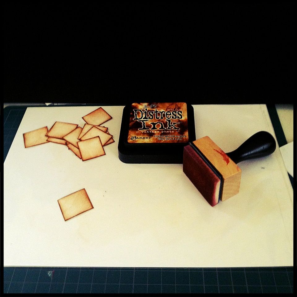
So the thing in white is my craft sheet if you can see it. It's just a plastic surface. and the pile of paper over at the corner are little squares I've cut out and blended ink onto.

Photobucket
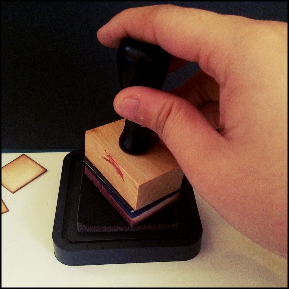
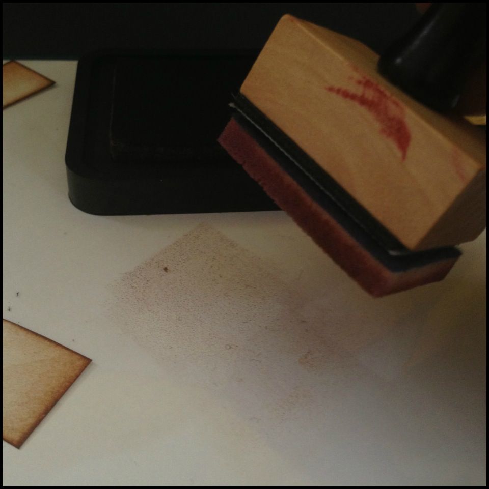
First, ink up your blending tool. The bottom of the tool is a detachable foam piece which you can change if you're changing colours. (So for the vintage photo colour I have one foam piece and for the evergreen bough I have another)
Photobucket
Transfer the ink to your craft sheet. Distressed inks are meant to be blendable, so they are really really wet and won't dry up so fast, especially on plastic surfaces. You may see little droplets, but they're really fine to use. From the ink patch that you've created, push the ink towards the paper in a circular motion. For this, I couldn't take a picture because well. Motion isn't really well captured by still pictures. But the idea is that the harder you press (the more force you use), the darker your paper will turn out to be). My personal preference is to have it dark at the edges and then gentler in the centre. HOWEVER, don't make the same mistake as me because to achieve that effect, simply use gentle motions multiple times rather than apply more force. 
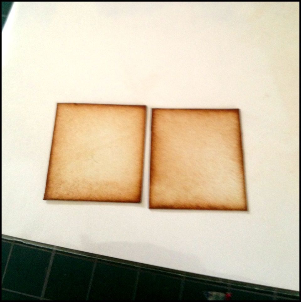
Photobucket
So, this is how it is supposed to look like, in my opinion. It should be a very even gradient which gives a sort of vintage, ageing kind of feel to it. 
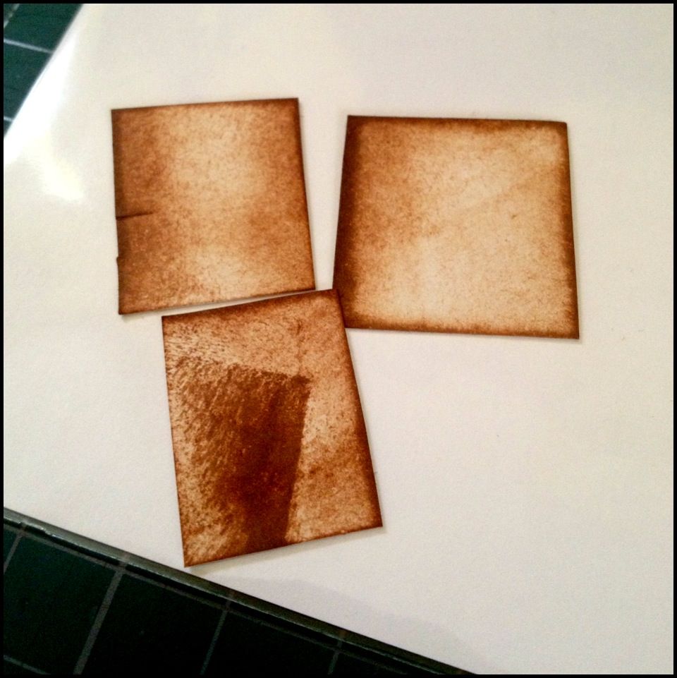
Photobucket
AND. this is how it should NOT look like, at least to me. For the top row, left side piece, some people like this darker texture, but because of what I intended my paper to look like, it looks like an error. For the top row, right side piece, one of the edges was subjected to way too much ink being pushed, which is what happens when you don't control the pressure properly. For the final piece, I'm sure we can all see that the creator of it applied ink a little "too much too soon" which resulted in...yeah, that. That's the most common mistake I've made. and when that happens you have no choice but to start again. 

It takes plenty of practice I think, but it's a really really fun technique to use, and you won't have to buy so many different pieces of paper. I would say buying the distressed ink was worth it, in terms of fun and usefulness. However, it's not really one of my essential tools. I'd use it if I have it, but if I don't, I think I could live without it. And that's probably because of my small budget. I'.ll put up a new post really soon to show you what exactly my "essential tools" are. The tools i just cannot live without. And you'll be surprised. Most of them look like they can be found in popular, instead of any boutique scrapbooking store(:

Sunday, December 16, 2012

Past Projects: Animal Card #1

So this "past projects" headline will hold all the projects I've done in the past, as I slowly attempt to document each and every one of them. Since I have the memory of a goldfish (unless we're talking about unimportant information, then my memory balloons elephant size), I will do my best to recount how I did these cards and scrap pages. As stated in my blog description, my scrapbooking journey is full of Ups and Downs. Ups like when I finally discover how to make the tool work for me, and Downs like when I mess up on the card. So it is with my recording. I will record both the Ups and Downs, and hopefully you guys (whoever reads this) can learn from my mistakes!

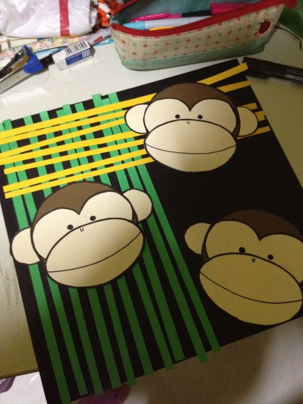
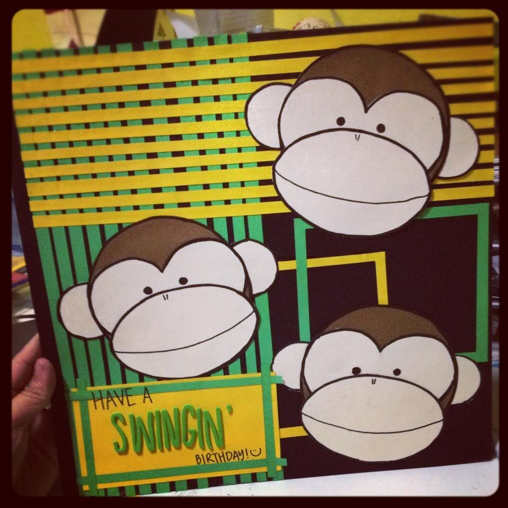
So this first card I did was for one of my friends in this big group that I have where everyone is in possession of an animal nickname (it's a rather long story), and so for her (and one other person) 21st birthday, I made a 12" by 12" card using her animal (monkey) as the theme. So I googled "monkey craft" to get an idea of the kind of proportions a monkey's head should have and I found this really awesome picture from fiskars website via pinterest. okay, to be absolutely honest, I didn't know about the fiskars website until I started typing this post. I based my monkeys off this image I saw on pinterest, and only JUST have I realised how much trial and error I could have avoided because the website (link above) details exactly how to make the monkey. So my lesson learnt is: always click the link back to the original. A lot of heartache and time could have been saved
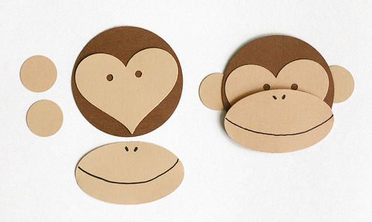
Photobucket
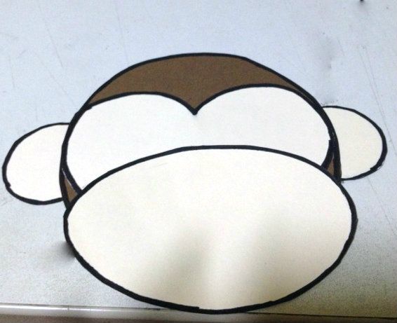
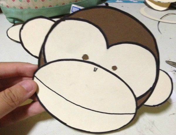
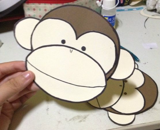
Anyway, as you can see in the picture above (which is from the fiskars website) you only need to cut out two small circles, one large circle, a heartshape and an oval. Really simple right! WRONG. I guess it would have been simple if I had the die cuts for them, but since I'm on a budget, I used my miracle tools: A compass, A pencil and a pair of scissors, added with a dose of agar-ation. Basically, I've not found another monkey that looks as proportionate and cute as this one or another monkey that appeals to me. I kinda wanted it to be cartoony but not too cute.

IMG_3037_zps88cdb8af


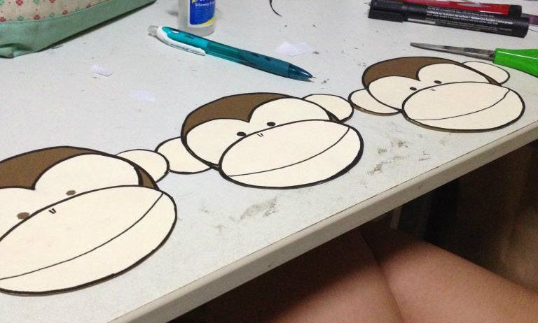
The pictures look a bit strange, but thats cos these pictures were taken before I realised I should use a plain (either black or white) paper to work as a background before I took them. you can also see that initially I followed the picture and punched out (or rather, I poked out) the eyes, however, that gave my monkey a little creepy kind of look. and so I decided to colour it in black instead. 

IMG_3039_zpsa3af96f9

IMG_3041_zpsb574db41

3 monkeys


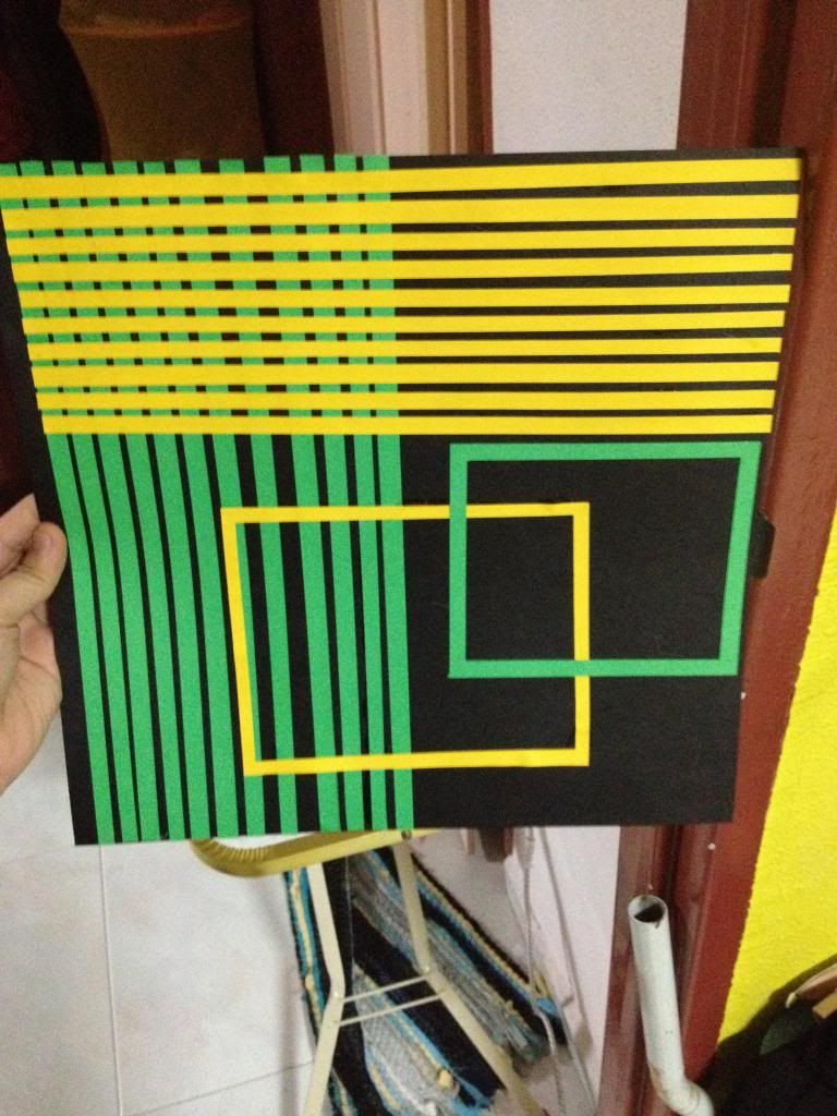
Arranging the 3 monkeys (cos 3's a magic number for proportions!) alone on the black paper made it look really really plain. So I decided to do the background in green and yellow strips to draw reference to the monkey  (bananas and trees anybody?) my initial plan was to do a checkered pattern alternating green and yellow to fill up the entire background, but I think the final product works much better.
Photobucket

Photobucket

Photobucket

After adding the background, I wanted a bit more yellow on the bottom, hence the title of the card 'Have a swingin' birthday' was placed on a yellow square with green borders. You will notice that a 12" by 12" card means that I had to stick two pieces of 12" by 12" paper together, and I left approximately 1cm on the left hand side to double-sided tape the pieces together.

Yupp, this is the first animal card, a really simple and easy to make card. In fact, you could use the monkey template for many other kinds of crafts too!(: Will be back with the second past projects post on the second animal (hint: it involves loads of cotton wool!!) really soon! Hope you've enjoyed reading this, and I hope it's not too lengthy for you(: 

*do give me comments and share other ideas as well, will love to hear them!

the obligatory first post

So I'm considering blogger as the hosting site for my blog because tumblr doesn't allow me to have pictures embedded within my text. However, the main reason I quit blogger and moved to tumblr was because the customization of themes which I feel is way easier to use than blogger's version. Or because I lean slightly to the side of the tech spectrum labelled "noob" and hence I find it really difficult to figure my way around. Anyway, I was flipping through other scrapbooking blogs and from Julia at the stamping ground , I found the easiest, prettiest free blog template website which led me to this bright and sunny template!

So. I wrote all of that about a month ago while I was in the midst of my exams. And now that my exams are over I can probably work on this blog properly...after I'm done resting!