Distressed Inking #1
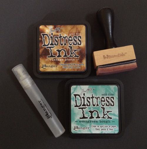
I've always wanted to try distressed inking, because I like the idea of making gradients on paper and the effect really looks quite cool. They're usually quite expensive though, so when I chanced upon maple treehouse (this really really awesome website for scrapbook tools at really reasonable prices) I decided to get all the tools I need. So, as you can see in the above picture, I got the Ranger Distressed Ink in evergreen bough and vintage photo colours ($6), the Ranger Inkssentials blending tool ($5.50), as well as the Ranger Mini Mister ($1.80) (which I won't be talking about today because I haven't quite mastered that tool yet!). There is a HUGE range of distressed ink colours (I was really surprised), but I would recommend starting with the vintage photo colour because brown really is the easiest to use if you want to create an aged effect.
So, how I "learnt" to use my tools was to watch this Tim Holtz video (starting from 4:06 approximately), repeatedly. And seriously, I mean I must have watched it a gazillion times because everytime I think I finally understood how to do it, it turned out looking wrong. I did try to use the mini mister to achieve a crumpled distressed look, unfortunately since I didnt want to ruin my mum's iron I decided to let it sit and wait, hoping that time would dry it...which as you may guess didn't really work out the way I wanted it to. Since the entire thing ended up looking like a dead fish's eye. Mushy and well, I didn't really want to take a picture of that.
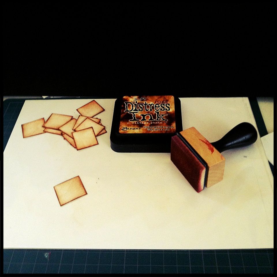
But I think I've begun to get the hang of the ink blending tool. In his video, Tim Holtz uses a craft sheet, which I thought was an unneccessary expense (I'm on a budget!) So I used an old plastic file, which worked just fine, except that it was green and I couldn't really see the ink properly. Recently I got a transparent folder (B5 size) from Daiso at 2 bucks, cut out a piece of 220gsm white paper, slotted the paper in, and taped up the ends and VOILA! works just as well as a craft sheet I think.
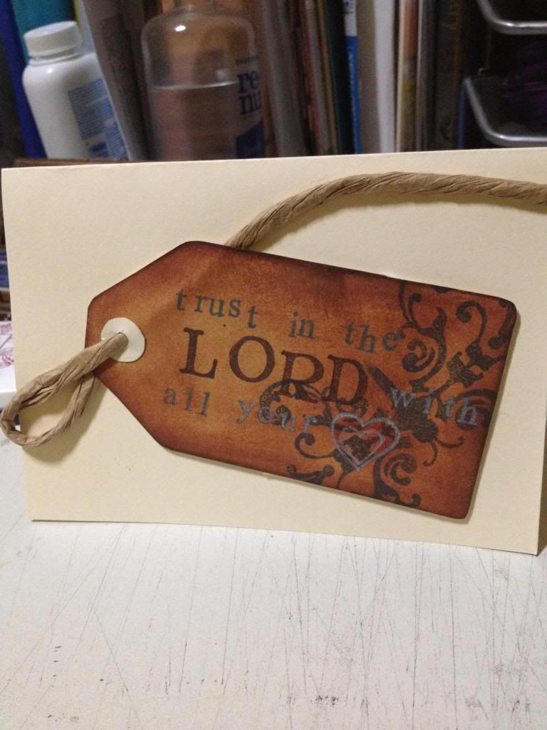
So this was the very first one I did with the blending tool. As you can see, It's kinda uneven because the entire thing looks brown to me. Might as well cut the whole thing from a brown piece of paper. It took me quite some time to get a hang of the "circular motion" thing that Tim Holtz talks about, but I think I've finally succeeded.
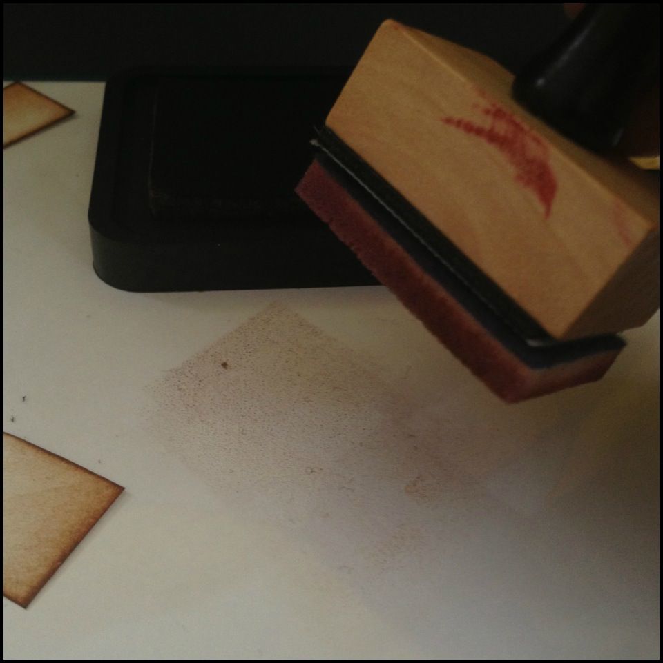
So the thing in white is my craft sheet if you can see it. It's just a plastic surface. and the pile of paper over at the corner are little squares I've cut out and blended ink onto.
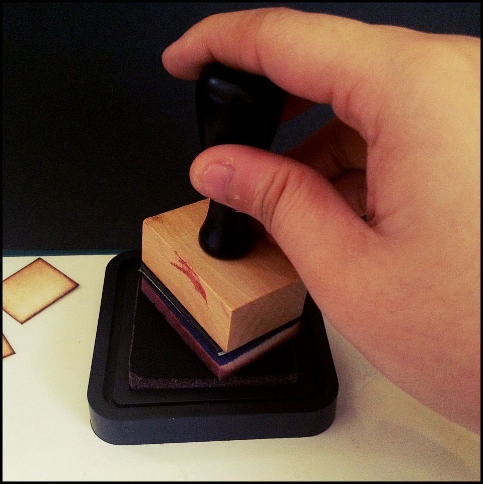
First, ink up your blending tool. The bottom of the tool is a detachable foam piece which you can change if you're changing colours. (So for the vintage photo colour I have one foam piece and for the evergreen bough I have another)
Transfer the ink to your craft sheet. Distressed inks are meant to be blendable, so they are really really wet and won't dry up so fast, especially on plastic surfaces. You may see little droplets, but they're really fine to use. From the ink patch that you've created, push the ink towards the paper in a circular motion. For this, I couldn't take a picture because well. Motion isn't really well captured by still pictures. But the idea is that the harder you press (the more force you use), the darker your paper will turn out to be). My personal preference is to have it dark at the edges and then gentler in the centre. HOWEVER, don't make the same mistake as me because to achieve that effect, simply use gentle motions multiple times rather than apply more force.
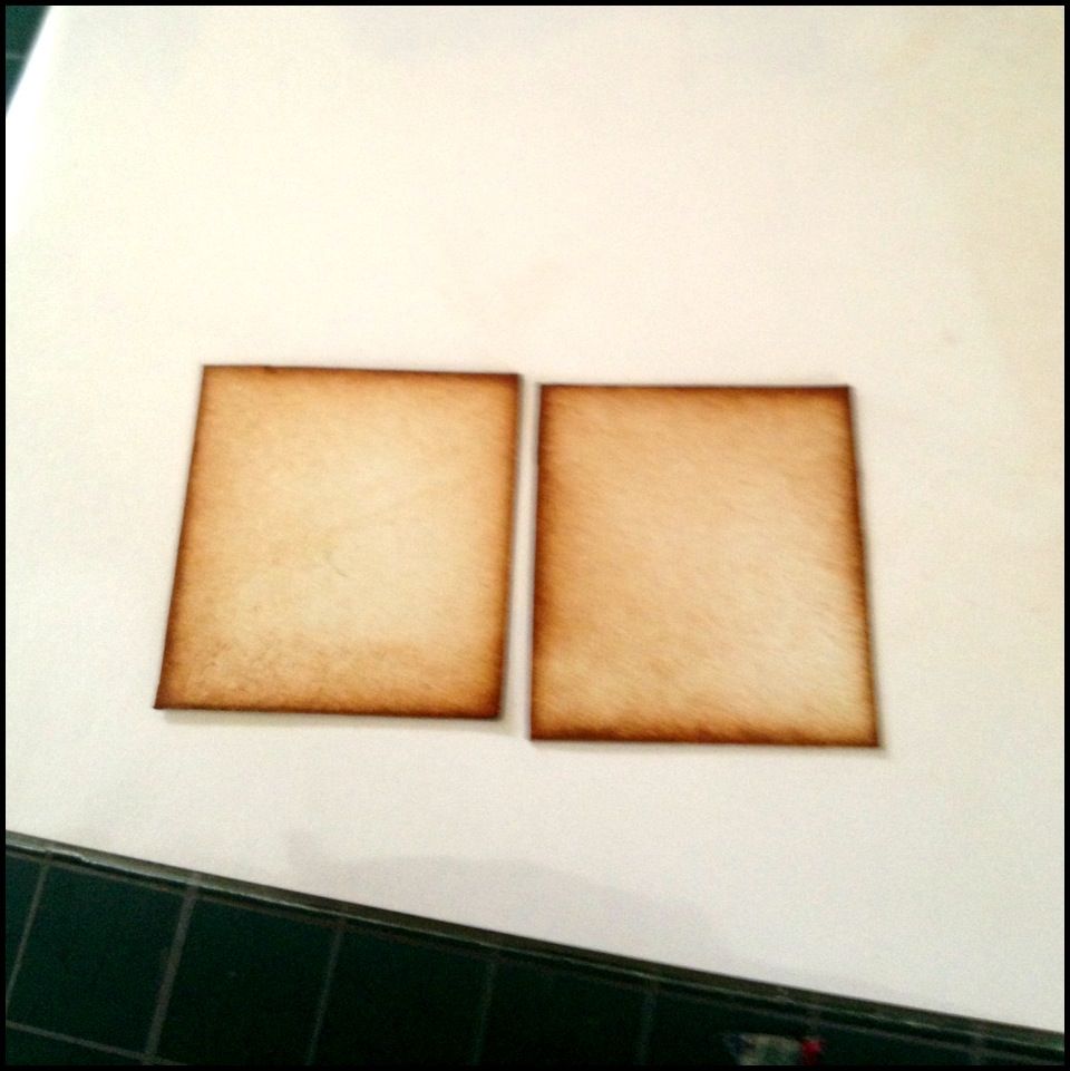
So, this is how it is supposed to look like, in my opinion. It should be a very even gradient which gives a sort of vintage, ageing kind of feel to it.
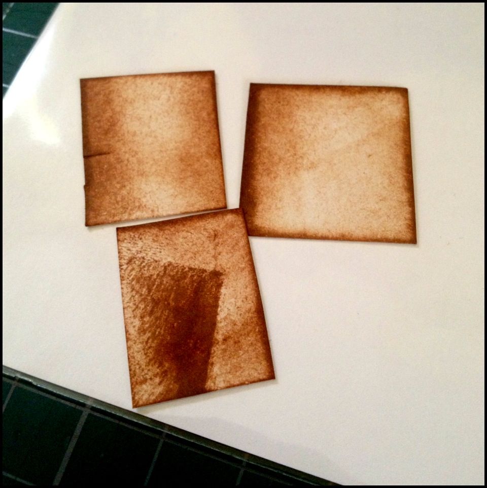
AND. this is how it should NOT look like, at least to me. For the top row, left side piece, some people like this darker texture, but because of what I intended my paper to look like, it looks like an error. For the top row, right side piece, one of the edges was subjected to way too much ink being pushed, which is what happens when you don't control the pressure properly. For the final piece, I'm sure we can all see that the creator of it applied ink a little "too much too soon" which resulted in...yeah, that. That's the most common mistake I've made. and when that happens you have no choice but to start again.
It takes plenty of practice I think, but it's a really really fun technique to use, and you won't have to buy so many different pieces of paper. I would say buying the distressed ink was worth it, in terms of fun and usefulness. However, it's not really one of my essential tools. I'd use it if I have it, but if I don't, I think I could live without it. And that's probably because of my small budget. I'.ll put up a new post really soon to show you what exactly my "essential tools" are. The tools i just cannot live without. And you'll be surprised. Most of them look like they can be found in popular, instead of any boutique scrapbooking store(:


0 comments:
Post a Comment